

Designing Account Exit Flows That Earn User Trust

Table of Contents
- 1 Why Account Exit Flows Matter
- 2 Deactivation Vs. Permanent Deletion
- 3 Make The Option Easy To Find
- 4 Explain The Consequences Before Confirmation
- 5 Use The Right Level Of Friction
- 6 Protect The Account Without Creating Barriers
- 7 Show Progress And Completion
- 8 Collect Feedback Without Guilt-Tripping
- 9 Test The Full Exit Journey
- 10 A Practical 2026 Checklist
- 11 Conclusion
Why Account Exit Flows Matter
An account exit flow is often a customer’s final direct interaction with a product. When that experience is confusing, hidden, or needlessly difficult, it can undermine trust built during onboarding, everyday use, and support interactions. Reviewing established delete account ui patterns can help teams recognize the common screens users expect, including consequence summaries, confirmation dialogs, verification steps, and clear completion states.
Users may leave for many valid reasons, such as changing needs, privacy preferences, cost concerns, or simply no longer needing a service. Respecting that choice is part of good product design. Research on account-deletion usability has highlighted a recurring gap between what users expect from deletion and the obstacles they can encounter when trying to complete it.
A well-designed exit path does more than satisfy a functional requirement. It shows that the organization can be transparent when the user decides to leave. That transparency can preserve goodwill and makes it more likely that a former customer will view the brand as trustworthy in the future.
Deactivation Vs. Permanent Deletion
Deactivation and deletion should never be treated as interchangeable terms. Deactivation generally means an account is paused, hidden, or inaccessible while the underlying account remains recoverable. Deletion means the account is removed or that a permanent removal process has begun.
Use language that matches the outcome
- Use Deactivate only when the account can be restored through a defined process.
- Use Delete when the request permanently removes the account or initiates removal after a stated waiting period.
- Explain what happens to posts, files, messages, preferences, and connected services.
- State whether the user can reverse the request, and specify the deadline if one exists.
Ambiguous labels create avoidable risk. A person who believes they are taking a temporary break should not discover later that their information has been permanently removed. Likewise, a user requesting deletion should not be given a vague “disable” option that leaves their account active without a clear explanation.
Make The Option Easy To Find
People should not need to search unrelated help articles, send a support request, or navigate a maze of menus to close an account. Place the option in an intuitive location, such as account settings, privacy controls, or a clearly labeled account management area. Use the same general placement across desktop and mobile experiences whenever possible.
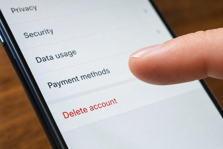
Visibility is an ethical design choice. Labels such as “Delete account” and “Deactivate account” are more useful than vague alternatives like “Manage profile” or “Other settings.” The option does not need to be visually dominant, but it should be discoverable by someone who is deliberately looking for it.
Explain The Consequences Before Confirmation
Before a user confirms an exit request, the interface should answer the questions that matter most. Clear, scannable copy is more helpful than a long warning written in legal language. Account-deletion guidance for Android apps emphasizes communicating the scope of deletion, any retention needs, and recovery details in a way users can understand.
- What data will be deleted, hidden, or retained?
- What information may remain for billing, fraud prevention, legal, or security purposes?
- Whether paid subscriptions or recurring charges require a separate cancellation step.
- Whether shared content may remain available to other people.
- When the deletion request will be completed.
- Whether the request can be canceled before completion.
Important details should appear before the final confirmation, not only in a policy page. If a subscription remains active after deletion, say so directly and give the user a clear route to manage it.
Use The Right Level Of Friction
Confirmation steps should be proportional to the consequence of the action. A reversible deactivation may require a single confirmation and an easy way to reactivate. Permanent deletion may justify a more deliberate step, particularly when it affects valuable data, paid services, or sensitive personal information.
- Summarize the requested action in plain language.
- Present the most important consequences before the final choice.
- Use a specific action label, such as “Delete my account,” rather than a generic “Continue.”
- Require a checkbox, typed confirmation, or similar step only when it meaningfully reduces accidental deletion.
- Keep a visible cancel option available until the request is submitted.
Friction becomes harmful when it is designed to wear users down rather than prevent mistakes. Repeated warnings, guilt-based messages, and confusing detours do not improve safety. They signal that the product is trying to make leaving difficult.
Protect The Account Without Creating Barriers
Account deletion is a high-impact action, so verifying the requester can be appropriate. Depending on the account and risk level, this may involve a recent sign-in check, password entry, email confirmation, or multi-factor authentication. The interface should explain why verification is needed and what the user should do if they cannot complete the preferred method.
Security should protect legitimate account holders without forcing them into avoidable support loops. Offer recovery or backup paths where the product can do so safely, and make error messages specific enough to help users resolve the problem.
Show Progress And Completion
Submitting a request is not the same as understanding its status. Some deletions take effect immediately, while others involve a processing period, review, or recovery window. A strong flow confirms that the request was received and tells the user whether it is pending or complete.
- State the current status in direct language.
- Provide a timeline when the product can reliably provide one.
- Explain how to cancel the request if cancellation remains possible.
- Send a confirmation message or receipt when appropriate.
- Ensure that status messages accurately reflect the underlying process.
Collect Feedback Without Guilt-Tripping
Optional exit feedback can reveal product issues that analytics alone may miss. A short survey can ask whether price, missing features, usability, privacy concerns, or lack of need influenced the decision. The user should be able to skip every question and complete the exit process without providing a reason.
Keep the tone neutral. “What could we improve?” is more respectful than language that implies the user is making a mistake or abandoning a community. Feedback is useful only when it is freely given.
Test The Full Exit Journey
Teams should test the complete path, not just the final confirmation dialog. A realistic review includes finding the option, reading disclosures, completing verification, submitting the request, and receiving the correct final status.
- Test with new, experienced, and returning users.
- Review desktop, mobile, and responsive layouts.
- Test keyboard navigation, focus order, and screen-reader announcements.
- Check accounts with subscriptions, payment methods, shared content, or multiple sign-in methods.
- Test network interruptions and failed submissions.
- Confirm that support documentation matches the actual product behavior.
A Practical 2026 Checklist
- Is the exit option easy to locate?
- Are deactivation and deletion clearly distinguished?
- Does the flow explain data, subscriptions, and shared-content outcomes?
- Is confirmation proportionate to the risk?
- Is verification secure and accessible?
- Can users tell whether their request is pending or complete?
- Is feedback optional and neutral in tone?
- Has the entire journey been tested with assistive technology and real users?
Conclusion
The best account exit flows do not hide the door. They make the choice clear, explain the consequences honestly, protect against unauthorized actions, and provide confidence after the request is made. Designing this experience with care respects user autonomy while reducing confusion, mistakes, and avoidable support work.